Really Bad Design and Bad Use of Icons...
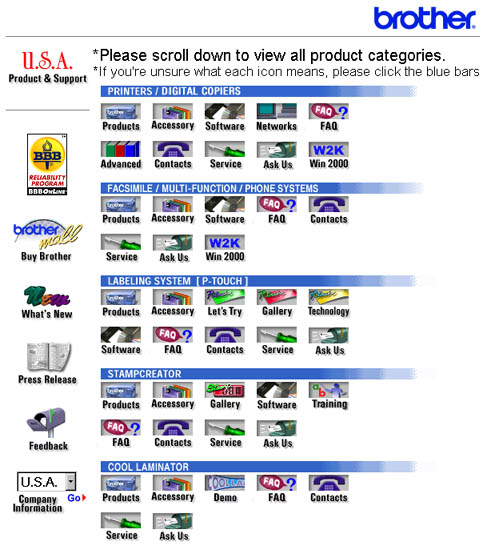
The graphic below is a screenshot of the home page of the printer manufacturer Brother. The use of icons here is simply confusing. It would probably take less time to understand what to do on this page, with text only rather than this
disjointed display of icons and symbols. Not to mention the directive to click on the blue bars if you are unsure of the icon meaning. It is certainly not an intuitive or even meaningful directive. Page location:
